Hi there! This is my Map Catalog for all the maps I'm going to collect over the semester for my GIS3015 class. I hope you enjoy them!
Thursday, April 17, 2014
Vector Map
A vector map consists of a data layer made up of a number of sparse features in geographic space that is usually represented though a geographical information system.
http://www.webresourcesdepot.com/all-free-vector-world-maps-ai-eps-svg/
Raster Map
http://www.grassbook.org/gallery/ch3getstarted/images.html
Star plots
Star plots are radar charts that is a graphical method of displaying multivariate data in the form of a 2D chart where many quantitative variables are represented on axes starting from the same point.
http://aapgbull.geoscienceworld.org/content/84/7/1041.abstract
Correlation matrix
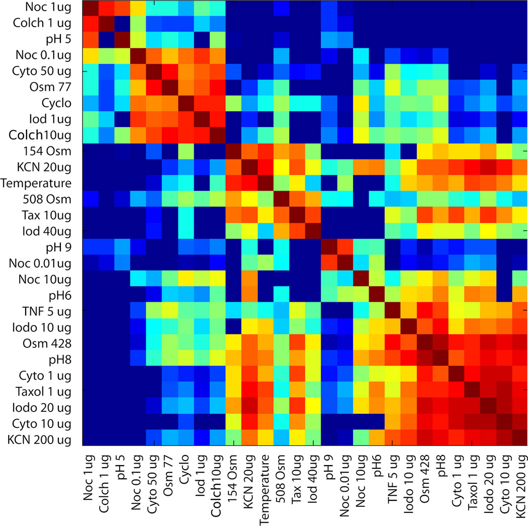
A correlation matrix map displays the correlation between variables. It represents the broad class of statistical relationships involving dependence.
http://www.emeraldinsight.com/journals.htm?articleid=1515237
Similarity matrix
A Similarity matrix is a matrix of scores that represent the similarity between different sets of data points. Each aspect of the matrix contains a similarity and these are strongly related to their counterparts on the maps.
http://spie.org/x48704.xml?pf=true&ArticleID=x48704
Stem and leaf plot
Stem and leaf plots is a method of the commonality of a number where certain class values that frequently occur.
http://www.shmoop.com/basic-statistics-probability/stem-leaf-plots.html
Box plot Map
A Box plot is a easy way to graphically depict groups or numerical data through their quantities. Box plots have lines extending vertically from the boxes that indicate at the variability that is being measured.
http://nelsontouchconsulting.wordpress.com/2011/01/07/behold-the-box-plot/
Histogram
A Histogram map is one that serves a a geographical representation of the distribution of data. It analyzes and displays the probability distribution of a continuous variable.
http://procomun.wordpress.com/2012/02/20/maps_with_r_2/
Parallel coordinate grapg
Parallel coordinate graph maps a re a common way of visualizing high dimensional geometry and analyzing data.
http://andrewgelman.com/2007/10/15/parallel_coordi/
Triangular plot
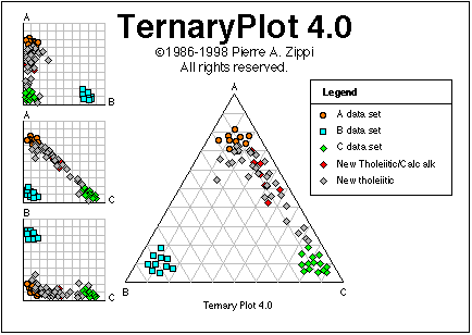
Triangular plot maps is a barycentric plot on three different variables which sum up to a constant. This type of map usually represents the ratios of the three different variables as positions in an equilateral triangle.
http://www.pazsoftware.com/Ternary5.html
Windrose Map
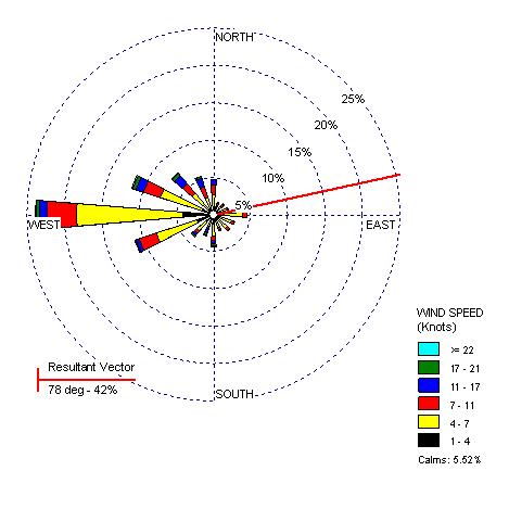
A wind rose map give an off-putting view on how windspeed and direction are typically distributed in a particular region. These sorts of maps are represented in a circular format to show which direction the wind in blowing in. The maps are made of different circles that represent different wind patter factors.
http://www.climate.washington.edu/climate.html
Climograph
A Climograph map is one that shows a graphical representation of basic climatic parameters at a certain location. This type of map can be used for a quick glance at the type of climate conditions of an area.
http://drought.unl.edu/DroughtBasics/WhatisClimatology.aspx
Population profile
A Population profile map is one that shows the number of people as a function of their ages. This map is shooing the profile of adults with and without AIDS.
http://www.ifad.org/operations/regional/pf/aids_1.htm
Scatterplot
A scatterplot map is a map that uses dots to represents certain data. It is a graph of plotted points that show a relationship between two sets of data. The dots are plotted off of an x and y axis and places in open space within the graphing area. These are similar to bivariate maps.
http://www.allbusiness.com/glossaries/scattergraph-scatter-plot/4950934-1.html
Index value plot
Lorenzo Curve Map
A Lorenzo Curve map is a graphical representation of the cumulative distribution function of the empirical probability distribution of wealth. This map is helpful for reprinting inequality on the wealth distribution in certain areas. The curve is a graph that shows the proportion of the distribution of inequality.
http://www.answers.com/topic/lorenz-curve
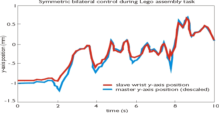
Bilateral graph
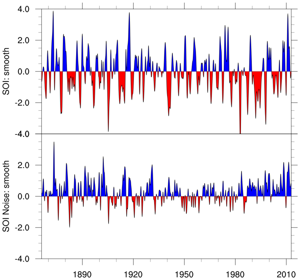
A bilateral graph map is a map that represents both positive and negative sets of data on one map. These sorts of maps allow a user to see more than one set of data at once. They can also be represented by line graphs, bar graph or some other kinds of maps as well. The above map shows control of assembly between master and slaves.
http://www.msl.ri.cmu.edu/projects/teleop/
Nominal area choropleth map
A nominal area choropleth map is a thematic map that represents areal data. These types of maps use different colors or symbols to distinguish between certain areas and regions. Nominal data is represented meaning that there is no ranking to this information so there are usually many different colors used to represent cartographic information. These types of maps are great for comparing measurements or data between states or regions.
http://my.ilstu.edu/~jrcarter/Geo204/Choro/Tom/
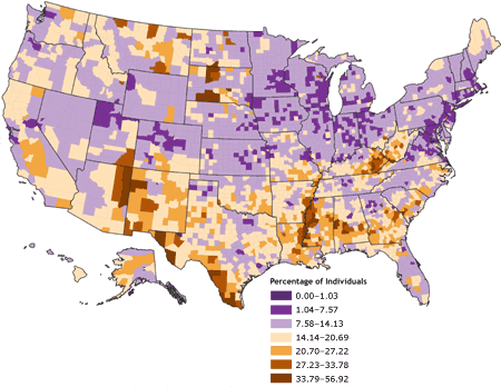
Unstandardized choropleth maps
Unstandardized choropleth maps are maps that contain data that have not been averaged even though it still allows comparison between variables.
http://www.cdc.gov/pcd/issues/2007/oct/07_0091.htm
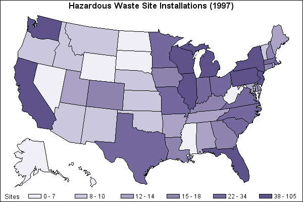
Standardized Choropleth Maps
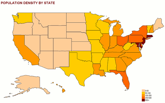
Standardized choropleth maps are a way of representing the calculated population of an area per square mile. This is so the distributions can be compared. The shading on this map shows the relative distribution in each state.
http://support.sas.com/sassamples/graphgallery/PROC_GMAP.html
Univariate choropleth maps
A univariate choropleth map is similar to a biunivariate map but only it displays data from only one variable. While doing this though it still falls under all the requirements of being a choropleth map even though it is much simpler than others. This map represents the estimated median household income in the United States.
http://www.colocarto.com/custom-thematic-maps.html
Bivariate choropleth maps
A Bivariate choropleth map shows two variables on a single map by combining two different sets of graphic symbols or colors. This is an important feature and technique in cartography. These types of maps are variations of simple choropleth maps that portrays two separate entities. simultaneously. The purpose of these maps are to find a simple method for accurately illustrating the relationship between two spatially distributed variables. This map is showing the percentage under the age of 18 years old.
http://www.geo.unizh.ch/~annal/Choropleth%20maps.html
Continuously variable proportional circle map
A continuous variable proportional circle map is similar to a dot distribution map. Continuous variable proportional circle maps show the distribution of a certain amount of variables and how they are proportioned through a land area. This map uses different sized circles to represent American Indian Population by state in the year 1990.
http://www.neiu.edu/~nerobert/Cartography.htm
Digital Orthophoto Quarter Quads Map
http://www.geomart.com/products/geodata/digital.htm
Wednesday, April 16, 2014
Digital Elevation Model Map
Digital Line Graph Map
A DLG is a cartographic map feature represented in digital vector form that is usually disbursed by the USGS. These maps are distributed in different sized scales with up to nine different categories of features deepening on the scale.
http://www.dnr.sc.gov/GIS/descdlg.html
Digital Raster Graphics (DRG)
DRG maps are the outcome of digitizing real life maps and making them into digital maps. All you have to do is scan a paper USGS topographic map to use on a computer. Theses DRG's are regularly used in GIS maps.
http://lter.msu.edu/maps/gis_data.php
Isopach
Isopach maps illustrate the thickness variations within a geological layer. They are contour lines of equal thickness over an area.
http://en.wikipedia.org/wiki/Isopach_map
Isohyets
Isohyets are areas on a map representing points on a map with similar amounts of rainfall at a given time. This can help people who want to potentially visit a certain region to aid them in either avoiding these areas or showing them exactly where they want to be.
http://www.crwr.utexas.edu/gis/gishydro03/Classroom/trmproj/Martinez/Martinez.htm
Isotachs
Isotachs are helpful in determining wind speeds on a map and in a certain region because they are lines on a map that represent wind speeds. These areas are usually areas of equal wind speeds that have been recorded over time.
http://www4.ncsu.edu/~nwsfo/storage/cases/20030123/
Isobars
Isobars are lines on a map that connects points that have the same atmospheric pressures at a given time or period. These lines are helpful in determining weather patterns for a certain region.
http://ww2010.atmos.uiuc.edu/(Gl)/guides/maps/sfcobs/cntr/wind.rxml
LIDAR
Lidar is a remote sensing technology that measure distance by illuminating a target with a laser and analyzing its reflected light. The word "Lidar" is a combination of the words light and radar. Lidar technology is a great method used to create high resolution maps.
https://www.leidos.com/geospatial/modeling/lidar-urban-modeling
Doppler Radar
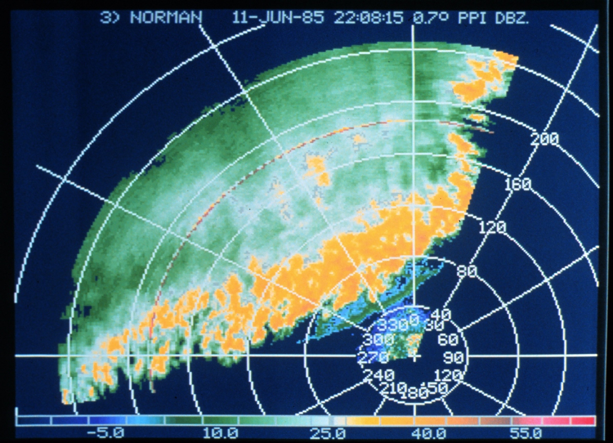
A doppler radar is a special radar system that uses the doppler effect to function. This produces velocity data about objects at a distance. Pretty much, it beams a signal at an object and then listens for the frequency at which it returns that is altered due to the objects motion. This system can give incredibly accurate reads of where an object is and how fast its moving. Doppler radars are used in aviation,meteorology, and radiology along with many other things.
http://en.wikipedia.org/wiki/Weather_radar
Black and White Aerial Photography
Infrared Aerial Photos
Infrared photographs are used by using special film that captures parts of the light spectrum that is not entirely visible to the human eye. Infrared photography is a combination of wavelengths that gives scientists a better understanding of whats happening on the Earth's surface. Infrared technology can be useful in assessing the health of plants because depending on what color their leaves are will reflect different shades of light. Unlike water that absorbs all the infrared wavelengths and appears black on film. Another helpful quality to these types of photographs are the ability to penetrate atmospheric haze. This therefore results in clear and crisp images of a particular areas suffering from haze. In general, infrared aerial photographs make it easier to collect accurate satellite images and high altitude aerial photographs.
http://kartor-konst.tumblr.com/post/500760413/infra-red-aerial-photographs
Cartographic animations
Animation in maps has been happening as old as maps themselves. This is because movement is apart of the environment. Animation in cartography is defined as a graphic art that occurs in time, animation is a dynamic visual statements that evolves through the change of the display. This sort of animation is not generally used though because it is expensive to make. There are mathematical computation software that crunches numbers to turn weather systems into moving maps though. It almost looks like what a Doppler radar maps put off only it is been computed by a machine.
http://www.geocurrents.info/cultural-geography/linguistic-geography/quentin-atkinsons-nonsensical-maps-of-indo-european-expansion
Cartogram Maps
A cartogram is a map that illustrates some type of thematic mapping variable such as population or travel time. For these types of maps the geometry or space of the map is distorted in order to correctly depict the information that one is trying ti display. There are two main types of cartograms, area and distance cartograms.
http://www.geocurrents.info/economic-geography/non-state-based-atlas-preface-part-ii
Flow Maps
Flow maps are maps that represent a mix of maps and flow charts, hence the name. The show the movement of objects from one location to another. This particular flow map is showing Charles Minard's visualization of French wine imports around the world in 1864. As you can see from the map above, flow maps can be used to represent almost anything.
http://datavisualization.ch/tools/flow-map-layout/
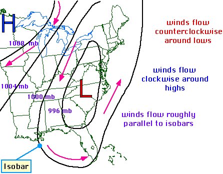
Isoline maps
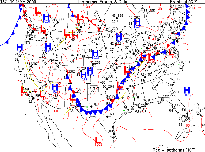
Isolines are often used on maps to represent points of equal value. Isoline maps then represent areas that are equal in value whether that be elevation or topography. On this map the isolines represent areas of similar high or low pressure.
http://stutzfamily.com/mrstutz/geography/weathermap.html
Proportional Circle Map
Proportional circle maps use different sized circles to display the relation of the size of circle to the certain information to be displayed on the map.
https://www.e-education.psu.edu/geog160/files/geog160/image/Chapter03/Federal_Expenditures.jpg
https://www.e-education.psu.edu/geog160/files/geog160/image/Chapter03/Federal_Expenditures.jpg
Saturday, April 12, 2014
Choropleth Map
A choropleth map is a thematic map that represents a statistical variable on a map by using shaded or patterned areas. An example of what a map like this would be population density or per-capita income. The use of choropleth maps are a easy way to visualize how a measurement varies across a geographic area that shows variability of a region.
http://www.cartozine.com/wp-content/uploads/2012/05/Unemp_Choropleth.jpg
Dot distribution maps
Dot distribution maps aka dot density maps are maps that use a dot as a symbol to represent the presences of certain features. These sorts of maps rely on visual scatter of the dots to show a pattern. There are two different types of dot distribution maps: One to one and one to many.
https://blogger.googleusercontent.com/img/b/R29vZ2xl/AVvXsEiFy5qNvdSY90bHhcR0hHBt092SGQMX2mZEENL8Ovdqzpi_3fMdUaOgtBIHoZ2j28xUCeq5KdCfVJLdnpDX1dgLZ6ZUPtXyrAKybbpU1XTlw_L6kyxn1gCdzHvvC26XpNY948fjKp7x_swS/s640/Election2012.jpg
Propaganda maps
http://esinophile.files.wordpress.com/2008/05/block-prints-of-the-chinese-revolution-2.jpg
Hypsometric maps
Hypsometric maps are maps that are related to using contour lines. They can be used to depict ranges of elevation as bands of color, usually in a graduated scheme, or applied to contour lines themselves. Hypsometric tinting of maps and globes are often accompanied by a similar method of bathymetric tinting to convey depth of oceans.
https://blogger.googleusercontent.com/img/b/R29vZ2xl/AVvXsEgLOzpUPYSJuPrsuYpCzvWU9W9UM9gVZtRDSEhnKrsVCklkPEFTyLw1WkG4w5TLjTQx_tgIi2GdO855mwVhga6OLfKyIIrsHWecCEWLGrrZkRbtQyjMtXpBeI1_Drk_6PR1wTjObSzRfCA/s1600/hypsometric.jpg
PLSS Map
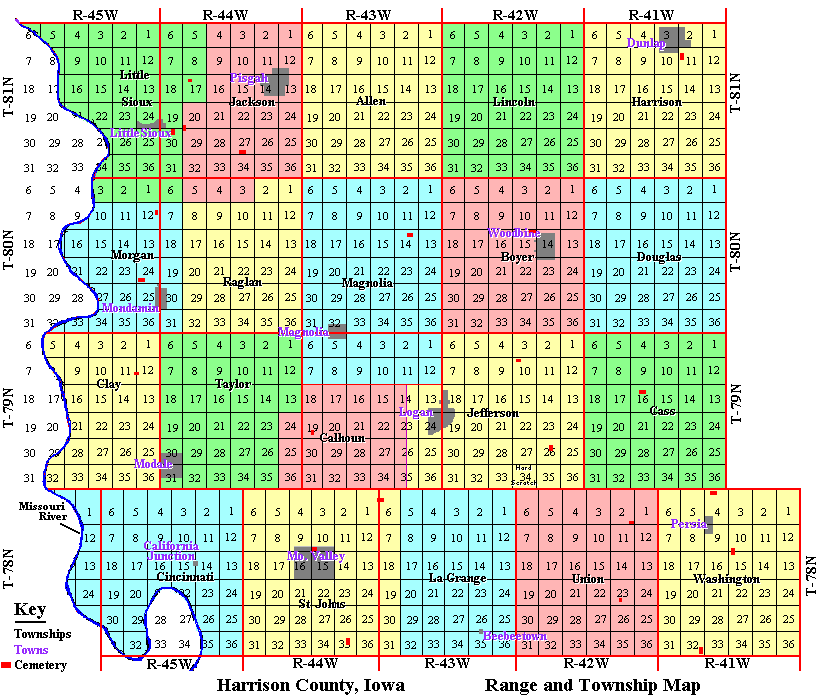
A PLSS map of Public Land Survey System is a way of describing and dividing land in the United States. The Bureau of Land Management is responsible for regulating the land in the US. All lands in the public domain are subject to division. This happens by a system of rectangular system of surveys that usually divides lands into 6-mile long townships which are then further divided into 1-mile long square sections. The PLSS is the standard for most land transfers and ownership in the US today.
http://www.blm.gov/cadastral/meridians/pmmap.jpg
http://iagenweb.org/harrison/maps/rangtown.gif
Tuesday, April 8, 2014
Cadastral Map
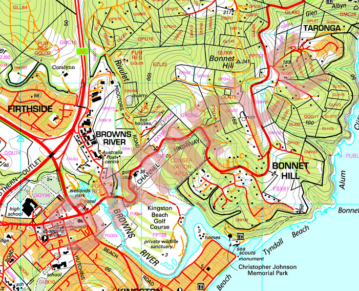
Cadastral maps display the spatial descriptions of land-parcel boundaries that define the location, shape and size of land parcels within the context of a regional or national geodetic positioning system. They also contain a unique parcel identifier to establish the link to the land-ownership information. When maintained in a real-time manner, cadastral maps can serve as the base for a reliable property rights system.
This Particular map that I have included is a hybrid of a cadastral map and a topographic map. All of the same characteristics stated above regard this hybrid map.
https://www.tasmap.tas.gov.au/upload/images/Samples/25k.jpg
Thematic Map
This is a thematic map representing population density by state. Thematic maps are types of maps specially designed to show a particular theme connected with a specific geographical area. These types of maps can portray specific aspects of a city, state. region or continent.
Topographic Map
This is a topographic map. Topographic maps are representations of a three dimensional surface on a flat piece of paper. The shaded relief portions on this maps are to represent elevation. Most maps are laid out in rectangular blocks with sides parallel to latitude and longitude lines. Topographic quadrangle maps west of the Mississippi River are laid out in township, range and section as well as latitude and longitude. Topographic maps can be helpful locating certain lines of an area.
Planimetric Map of Tallahassee, FL
Planimetric maps are distinguished by being a "surface map" and most well recognized as street maps. The horizontal features are depicted and the vertical are not included in planimetric maps.This is a road map of Tallahassee, Florida and is a form of planimetric mapping because there are no contours or relief features. The map is purely two dimensional to give the reader a picture image of the location of each major road in the city of Tallahassee. In using a road map such as this one the reader does not need to know information such as defaults in the surface or elevations of land. The knowledge that is needed is the location of the placement of streets in order to get from place to place as well as a scale in order to estimate time of travel.
https://blogger.googleusercontent.com/img/b/R29vZ2xl/AVvXsEjnE1OEcvSsH85GB-r3km-L3o_ElSq1xQUQ9w0KzPohMaoUT4pjqjiBhG5_9oq2iaYEbJVz0gYlz6Gu4DytYmshcuzJZkWRlKIjLuorT1vmWqz1wsoTET_b9K1j78i0Dy-XKZ-_fbZnj20q/s400/road_map_of_tallahassee_fl_usa.gif
Subscribe to:
Comments (Atom)


